SEGA
Role: Art Direction / Concepts / UI
Media: Brand / Website
Client: SEGA
Pitching, Creative/Art Direction, Conceptual Art, UI Design & Building Modular Design System.

THE PITCH
SEGA wanted to overhaul and modernize their US/Europe site with a flexible system that could be easily adapted and updated across their full range of IPs, providing a fresh look and further establish their evolution in the modern gaming space.
I designed & directed the visual direction and solutions for the pitch, focusing on a new era for SEGA that needed to feel current, exciting, and fast-paced, while honoring SEGA's legacy without feeling retro or outdated.
Creating key slides to visually convey our ideas and brand direction, showing how we would meet SEGA's requirements and add further value with long-term strategies, all in a clear and engaging format.
I really wanted to push our presentation by showcasing deep understanding of the brand and its goals, striving to distinguish us from the competition and make a memorable impact.


CREATIVE
TERRATORIES
Da-Ding! Pitch Level COMPLETE! We were chosen to partner with SEGA to bring their goals to life. Proceed to LVL-2 Creative Territories. (What an amazing day that was!)
SEGA, aside from their logo and blue tone, lacked a defined set of brand assets, styles, typefaces and tone. I developed three distinct creative routes to explore and clarify their brand identity, helping them uncover who they are and how they want to be perceived.
These routes help us align on the emotional tone, visual style, and narrative direction, serving as a reference for developing content and design frameworks as we progress while also generating excitement for the stakeholders.
It’s also my unchained space as a designer to explore and push ideas to their limits, not just for digital media but for all brand elements, bringing the full range of possibilities to life that may evolve and grow.
ROUTE 01
Using their distinctive brand logo and key line as a foundation, developing a series of portals designed to capture and convey the power, flair, and attitude of SEGA’s diverse franchises.
This approach represents SEGA’s modern evolution: it’s fast-paced, dynamic, and integrates legacy assets into a contemporary context.
SEGA UNIVERSE


ROUTE 02 -
The new era of SEGA is about more than just gaming; it's about entertainment.
We emphasize the immersive nature of their video games and media, showcasing stories, characters, and epic moments with full-screen visuals and minimal distractions for a seamless experience.
The SEGA brand steps back to spotlight the franchises and their offerings. Through carefully layered storytelling and captivating visuals, we create a cinematic journey where each IP has the space to fully express itself.
IMMERSIVE MOMENTS


ROUTE 03 -
The wildcard route redefines SEGA’s image, calling users into an exclusive experience as if their cool older brother is sharing the ultimate story.
Rather than relying on logos, bold typography takes centre stage. Blocks of colour indicate transitions between worlds, while multiple columns, rows, vertical and horizontal text, and unconventional layered graphics contribute to a cutting-edge feel. From the moment users arrive on this site, it’s clear that a new era has begun for SEGA.
DISCOVER YOUR ATTITUDE


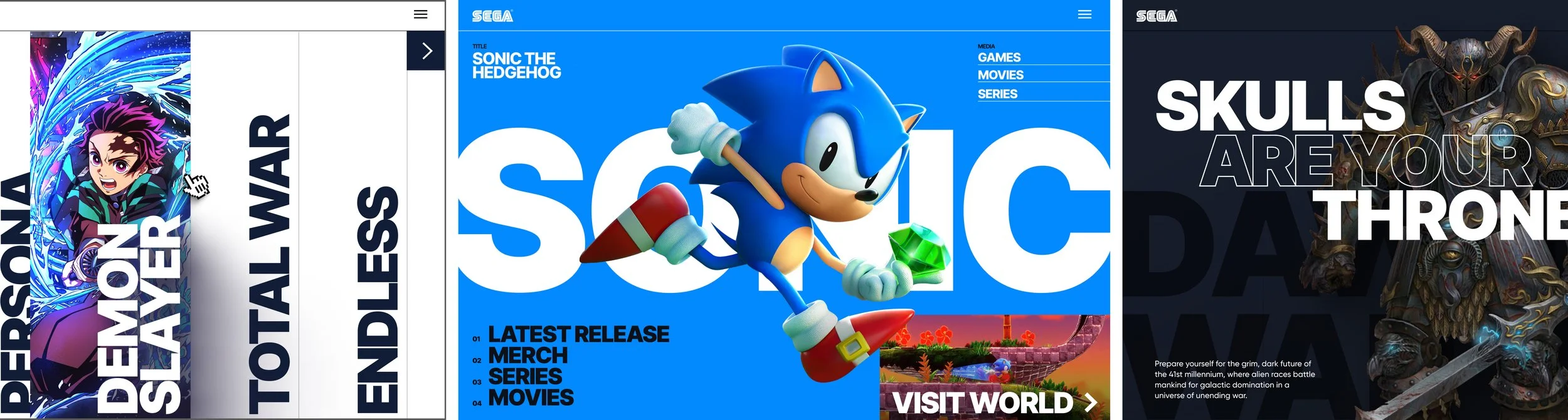


THE SEGA CORE SITE
The core pages for SEGA were crucial for highlighting and driving discovery of the company's extensive array of rich franchises and diverse content - promoting discoverability to help increase purchases and their expansion into movie and series.
To achieve this, pages are structured to drive users to new content, discovering the full breath of franchises SEGA has to offer.
The overall style captures the dynamic and playful spirit that SEGA is known for, mixing brighter tones with areas of darker immersion creating an engaging and immersive user experience and foster a deeper connection with the audience, reinforcing SEGA’s legacy and innovation in the gaming industry.


SEGA wanted to expand the offering on their site, to show not just who they are and their franchises but adding further value through targeted store, downloadable content, movies, shows news.


The SEGA core pages were build with a robust design system as it’s backbone, to allow coherence and consistency and allow for new configurable pages and content to be created at fast pace.

WORLDS
World Pages, also known as franchises, are dedicated pages showcasing the diverse array of titles within their domain.
Providing users with a space to explore their favourite worlds and discover new characters, lore, and history, allowing them to delve deeper into the essence of the franchise. Alongside suggesting similar franchises to help further engagement.
These pages were designed to use the modules from the core system while incorporating customisable elements to highlight their unique styles and themes.


The worlds featured a unique set of modules designed specifically for them, though all core elements derived from the Sega Core base system.

GAMES
At this stage, SEGA branding takes a backseat, allowing the Game pages to shine with their own unique flair and personality, fully showcasing the distinctive vibe of each game.
The pages are designed to highlight core information about the title that excites and deepens discoverability, featuring characters, upgrades, and new stories to be played.
At their core, they aim to drive sales for SEGA’s titles by engaging and informing potential players of the content and the range of options when purcahsing.
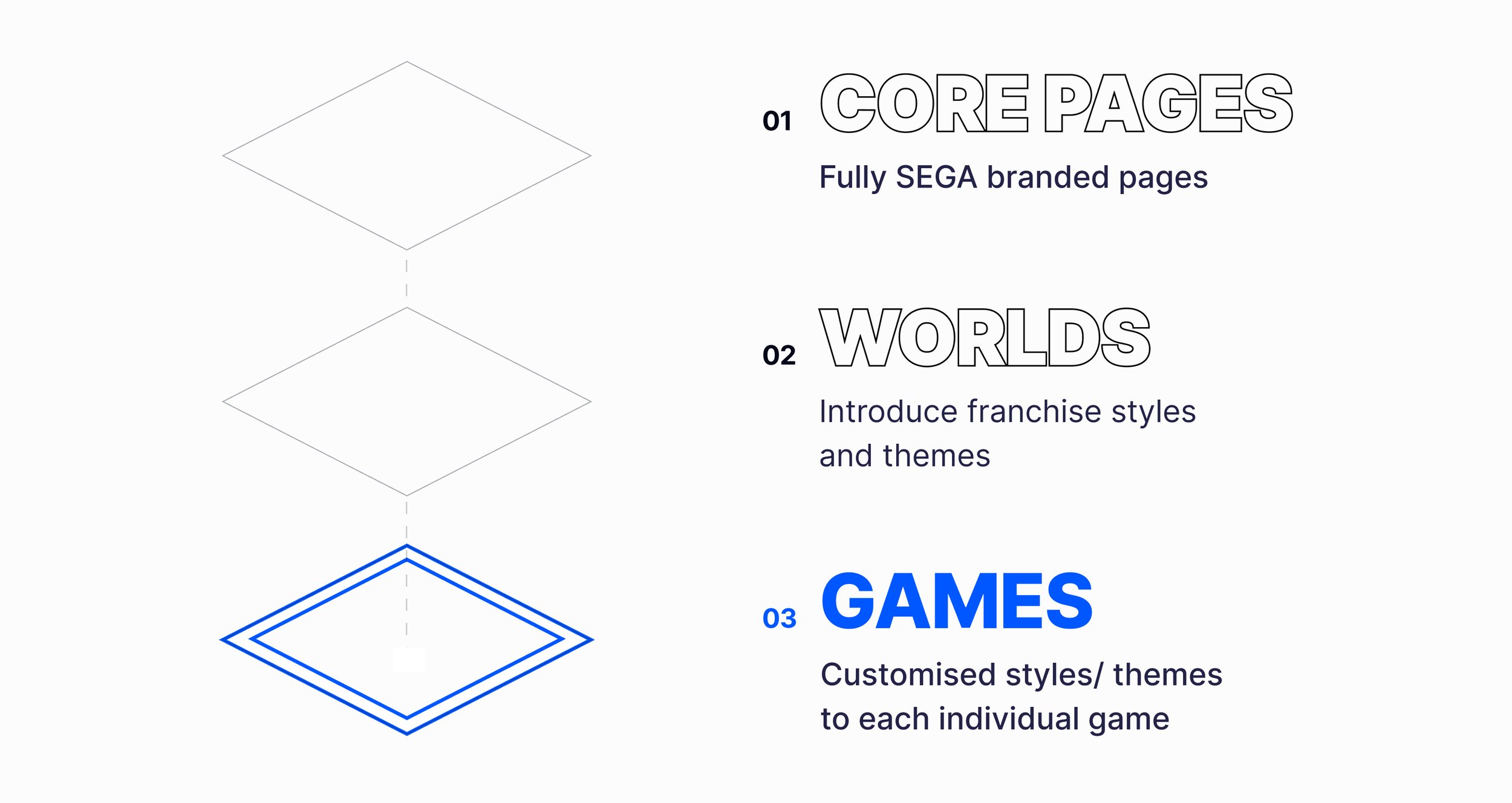


Each page module needed to as customisable as possible for each game, to ensure the vibe and style of each individuals game shone through. However all had to link back to a simple template, but once customised make it difficult to see it was past of a simple template structure.

The game pages employed a tailored design system and set of modules and templates to ensure consistency and cohesion, while incorporating custom colour palettes, unique UI elements, images, backgrounds, and typography.


Being a SEGA fan from a small child myself, this project was an absolute dream come true and being part of the next era of SEGA is impossible to put into words.
Sharing my love of gaming and seeing my son discover SEGA the gaming brand that means so much to me is globally loved and revered was the ultimate highlight.
